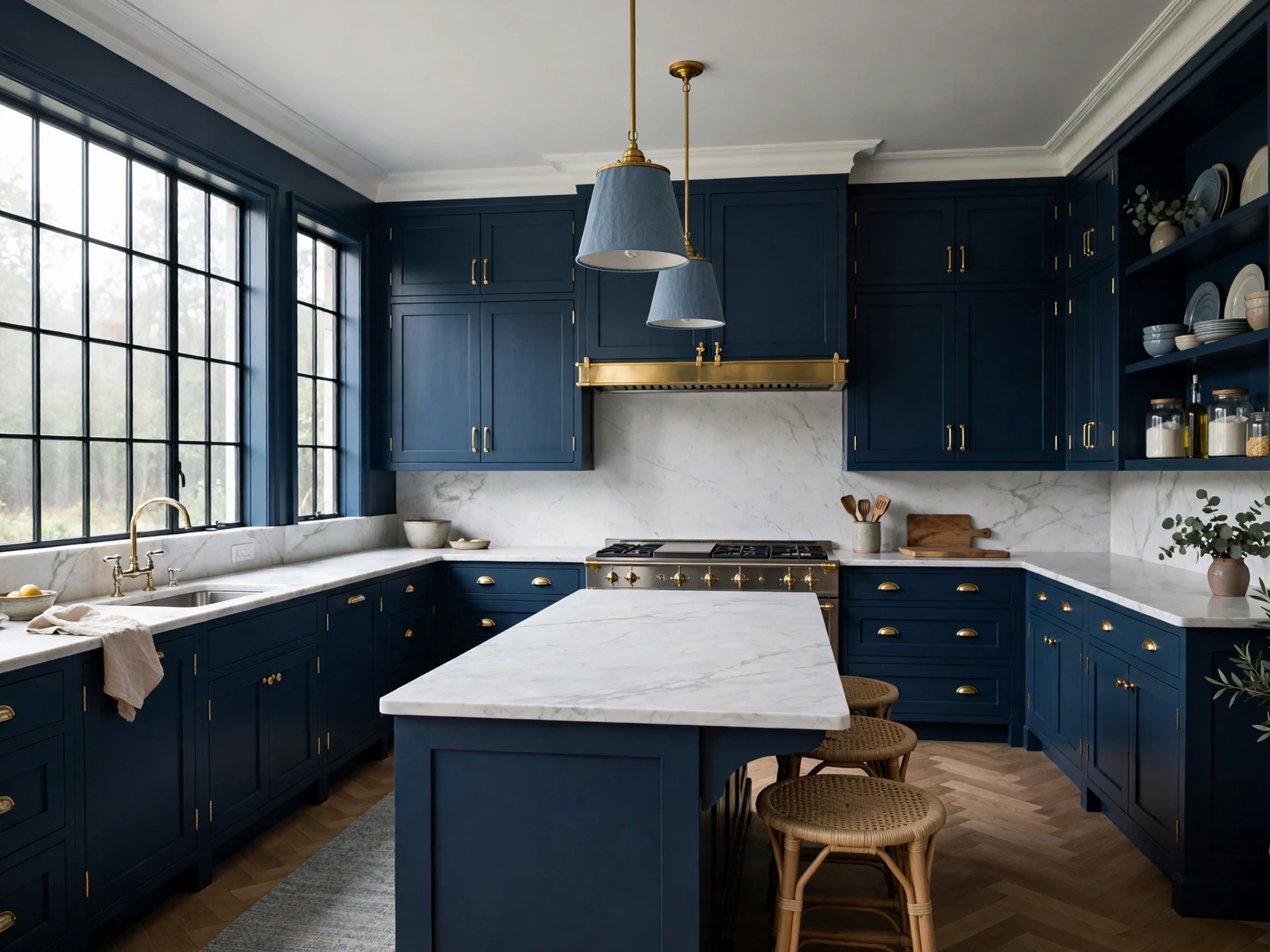
21 Moody Blue Kitchen Ideas for a Bold, Elegant Kitchen
A moody blue kitchen looks stunning in photos, but in real life it can go wrong fast. Too much navy and the room feels dark. The wrong blue turns cold or almost black at night. That is why most people love the idea and still hesitate, and honestly, the hesitation is fair. Deep blue needs a plan, not just a paint tin.
The good news is that the plan is simple. Pick the blue for the light you actually have, keep one surface light in every version, and warm the whole room with brass, wood, and layered light. When those three things are right, navy stops being risky and starts being the most elegant colour in the house. It feels calm, a little dramatic, and surprisingly easy to live with.
Below are 21 moody blue kitchen ideas that follow that rule. Each one is a complete look on its own, so you can take the one that fits your kitchen, your budget, and your light, without repainting everything or starting over.
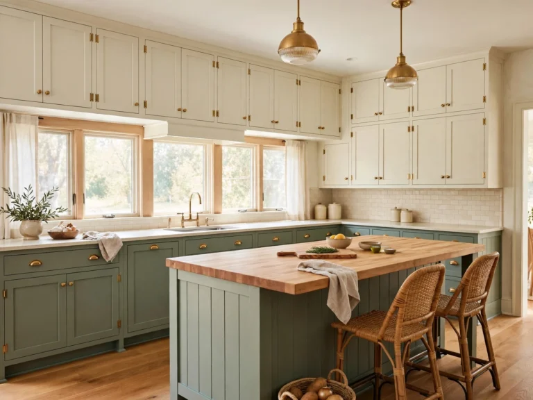
1. Navy Lowers with White Uppers: The Safest Moody Split
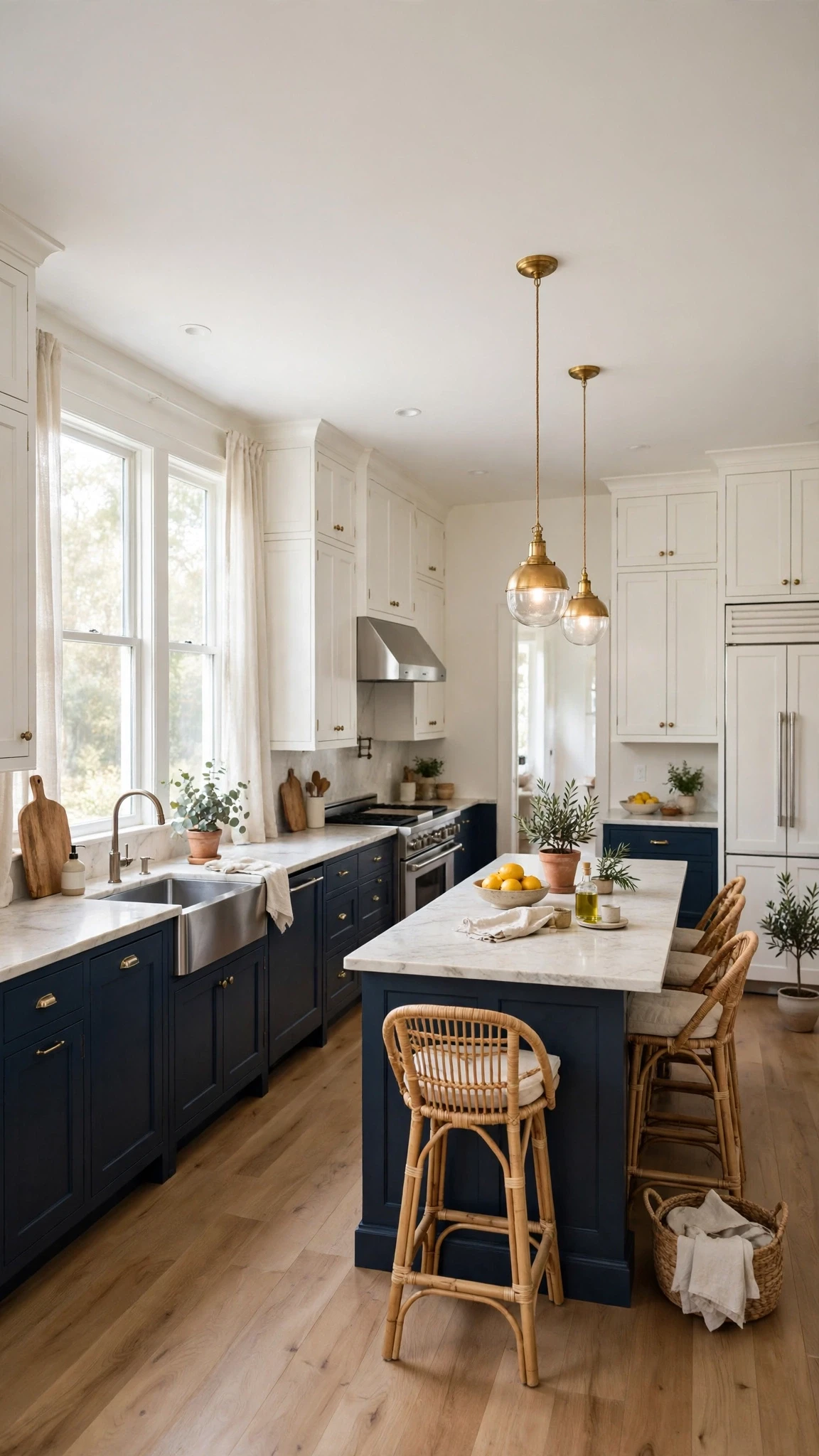
Paint the lower cabinets navy and keep the uppers white, and you get the drama without the darkness. The eye reads the room as bright because the top half stays light, while the navy at the bottom grounds everything and hides everyday marks. It is the easiest way to try moody blue, and the one most people end up loving long term.
Keep the counters light and the hardware warm, brass or brushed gold, so the split feels deliberate rather than half-finished. A white or pale grey backsplash between the two colours ties it together, and if your floor is warm wood, the whole scheme suddenly feels rich instead of cold.
2. One Deep Blue Island as the Only Dark Piece
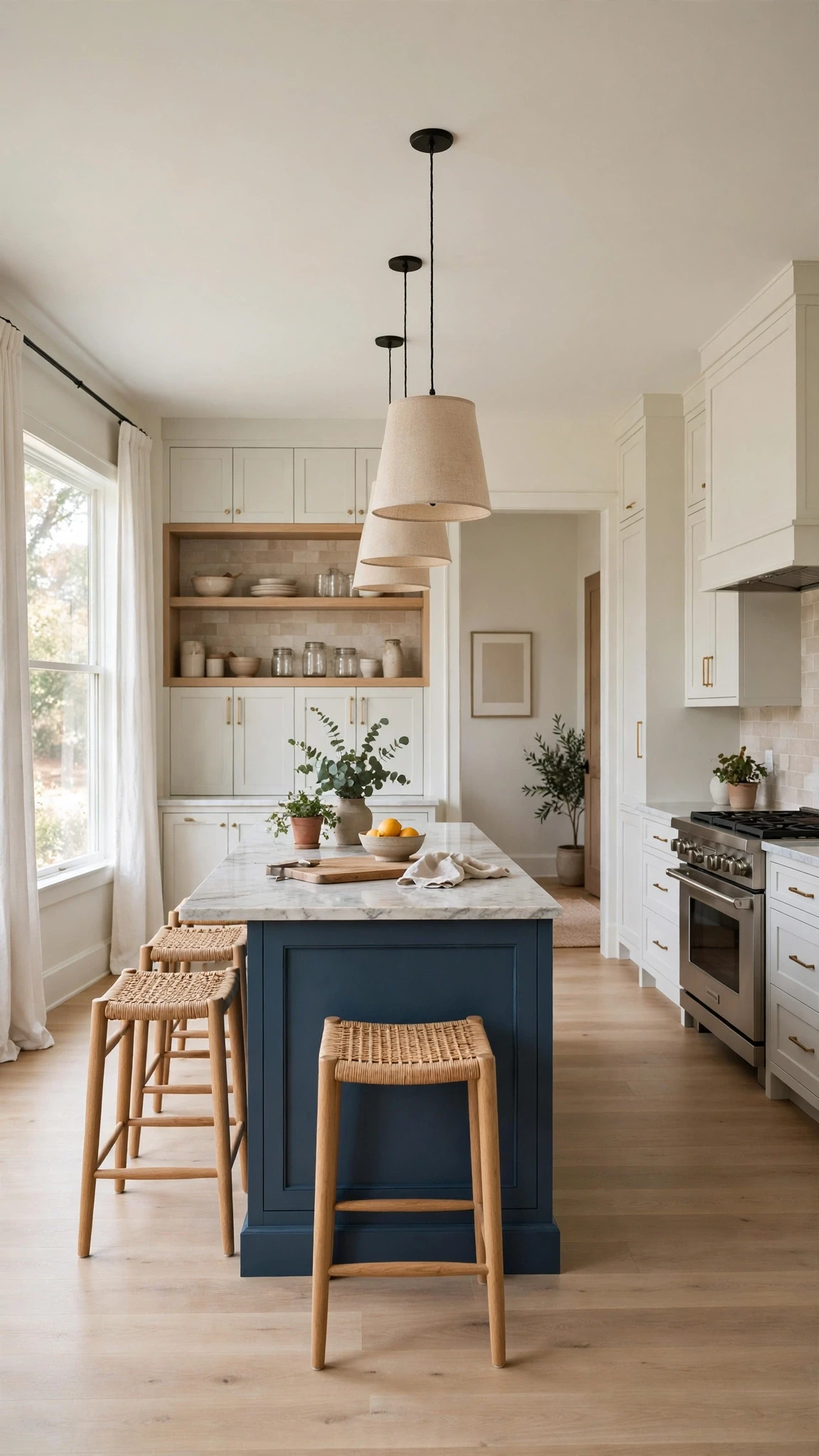
If a full navy kitchen feels like too much, make the island the only dark thing in the room. One deep blue island against cream or white cabinets reads as a bold furniture piece rather than a colour commitment, and it changes the whole kitchen for the price of one paint job. Guests notice it first, which is exactly the point.
Let the island carry the drama and keep everything else quiet: light counters, simple stools, and one warm metal. Brass pendants above it echo the warmth without competing, and because the rest of the room stays pale, the island never makes the space feel smaller.
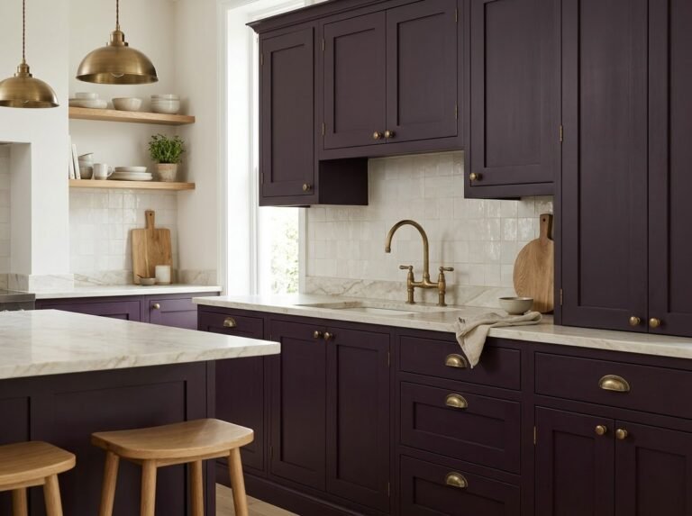
3. Full Navy Cabinets with White Marble Counters to Lift Them

A full navy kitchen works when the counters do the lifting. White marble, or a good marble-look quartz, throws light back across the room and stops the navy from closing in. The veining also gives the eye something to follow, so a wall of dark cabinets feels textured rather than flat.
Keep the backsplash pale and the hardware brass, and the kitchen reads as classic rather than gloomy. This is the version to choose if you love the look of a grand, old-house kitchen and your room gets decent daylight, because the marble needs light to do its work.
4. Slate Blue Cabinets for a Softer Moody Look

Not every moody blue has to be navy. Slate blue, with its grey undertone, gives you the same depth with a softer edge, and it suits rooms that do not get much sun. Where true navy can turn almost black in low light, slate stays readable and calm, more like a cloudy evening than midnight.
Pair it with cream walls and warm wood, and the grey in the blue stops it feeling cold. It is a good pick if you like the moody idea but live with north-facing windows, or if your home leans more relaxed than formal.
5. Matte Navy Finish So the Colour Reads Velvety, Not Shiny

The finish changes the colour more than people expect. A matte navy finish absorbs light and reads velvety, almost like fabric, while a gloss navy can look hard and a little plastic. Matte also hides fingerprints and small dents better, which matters in a kitchen that actually gets cooked in.
The trade-off is cleaning: matte shows grease if you let it sit, so wipe it down with a soft cloth and mild soap rather than scrubbing. Done that way, the velvety look lasts, and the kitchen feels expensive without any extra cost beyond the paint choice.
6. Brass Knobs and Pulls Against Navy Doors

Brass is the classic partner for navy, and it earns that reputation. Against a dark blue door, a brass knob catches the light and gives the eye a warm resting point, so the cabinets never read as one big dark block. Cup pulls on drawers and small knobs on doors is a combination that works in almost any kitchen.
You do not need to spend a fortune here. Swap the hardware before you repaint anything, because new knobs alone can make tired cabinets feel intentional. Warm brass, not bright gold, is the tone to look for, and keep the finish consistent across the room.
7. A Brass Faucet as the Warm Focal Point

A brass faucet does more work than it should for one fitting. It sits right in the middle of the room, catches the light every time you walk past, and warms up everything around it, including the navy cabinets behind it. If your budget only stretches to one brass piece, make it this one.
Choose a simple shape rather than something fussy, because the colour is already doing the talking. A bridge faucet suits a traditional kitchen, while a single clean arc works better in a modern one, and either way the brass will age gracefully if you wipe it dry after use.
8. White Subway Tile Backsplash with Navy Cabinets
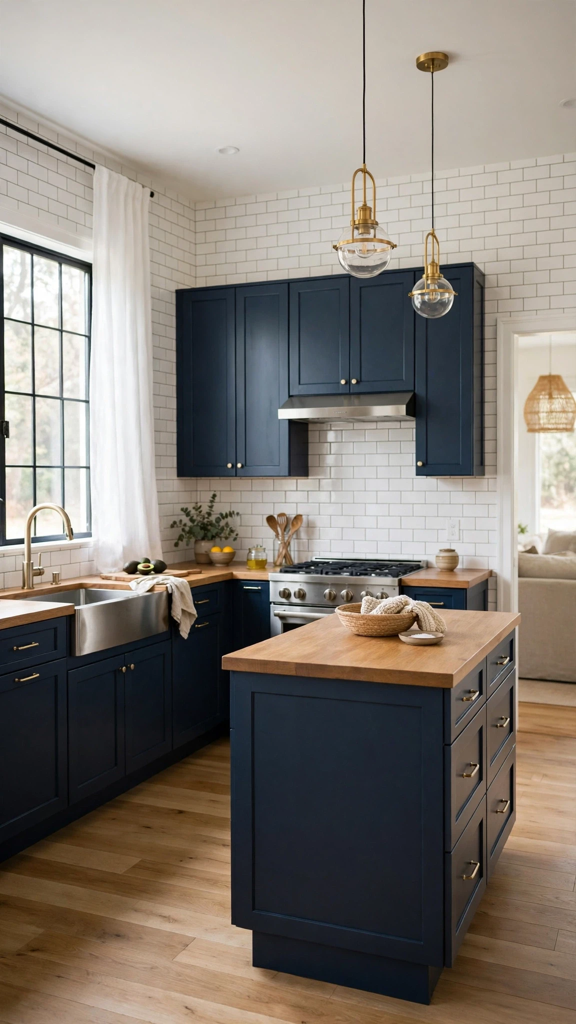
White subway tile is the reliable friend of a navy kitchen. It bounces light around, it costs little, and its simple grid stops the room from feeling busy. Against navy cabinets, the contrast is crisp without being harsh, which is exactly what a dark kitchen needs.
Warm up the grout slightly instead of going bright white, and the whole wall feels softer and less clinical. Run the tile up to the underside of the cabinets, or all the way to the ceiling behind open shelves, and the vertical lines will make the room feel taller too.
9. Blue Zellige Tile as One Feature Strip

If plain subway tile feels too safe, one strip of blue zellige tile changes everything. Its handmade, slightly uneven glaze catches light differently from every angle, so a single band behind the hob or sink becomes the feature of the whole kitchen. Keep it to one strip, though, because zellige is a strong voice and a full wall of it can shout.
Let the rest of the backsplash stay quiet, cream or white, so the feature strip reads as jewellery rather than wallpaper. It is a small area, which also keeps the cost down, and it is the detail guests will ask about.
10. Butcher Block Counters to Warm a Navy Kitchen

Butcher block is the fastest way to warm up a navy kitchen. The honey tones of the wood sit beautifully against dark blue, and the natural grain stops the room from feeling too polished or cold. It also ages well, picking up marks that read as character rather than damage if you oil it now and then.
Use it on the island or one run of counters rather than everywhere, especially near the sink, where water is its enemy. Paired with white marble elsewhere, you get warmth and practicality in the same kitchen, and the mix of materials feels considered rather than accidental.
11. Open Wood Shelves to Break Up Dark Cabinets
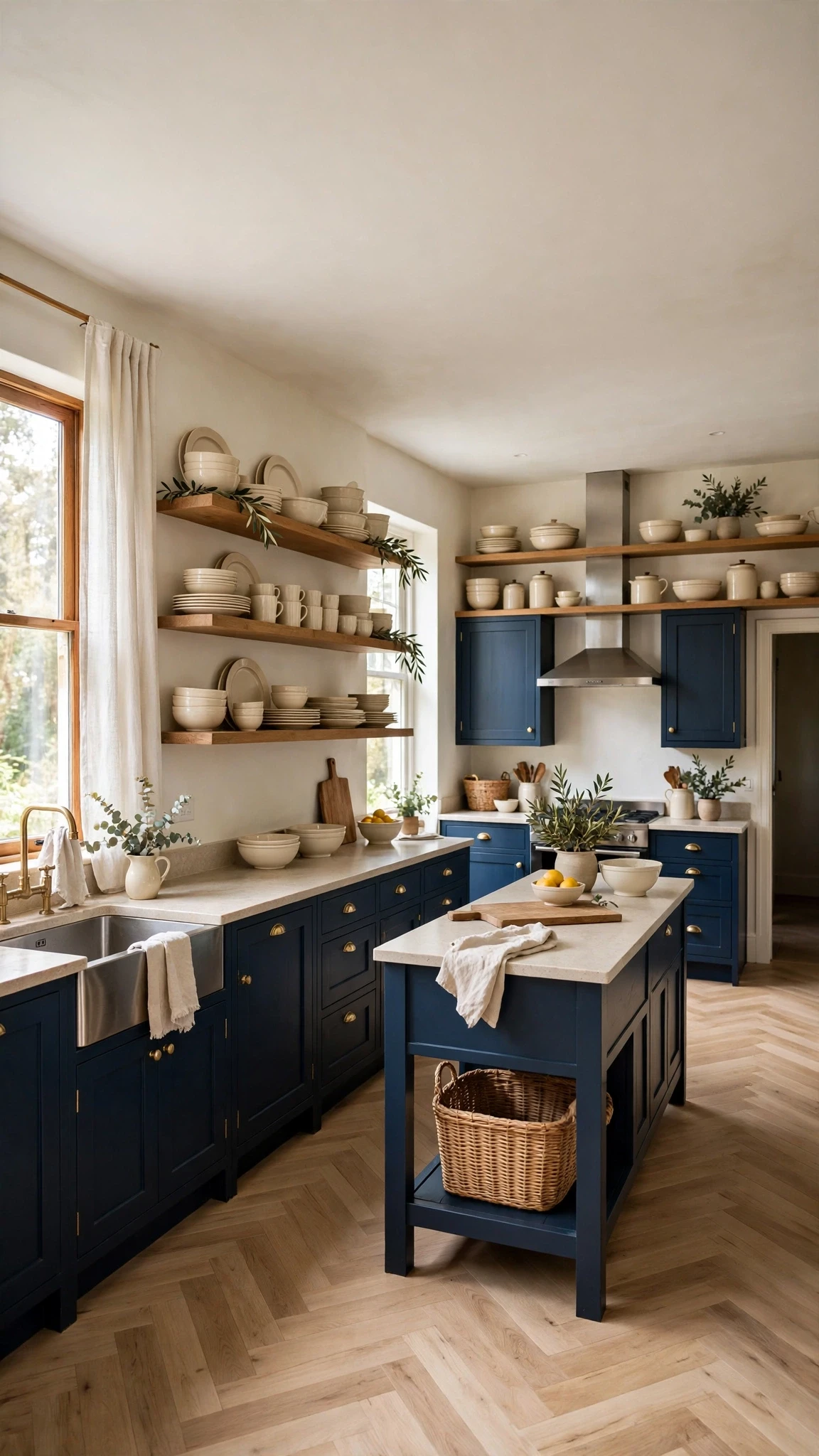
A run of dark cabinets can feel like a wall, and open wood shelves are the simplest way to break it. Swap one bank of uppers for two or three wooden shelves, and suddenly there is air, light, and a place for the cream dishes and plants that soften the navy. The wood also brings in the warmth that dark blue needs.
Keep what you display simple, because crowded shelves undo the calm. A few stacks of cream bowls, a couple of jars, and one trailing plant are enough, and the shelves themselves become part of the colour scheme rather than just storage.
12. Warm Wood Floors Against Navy Cabinetry
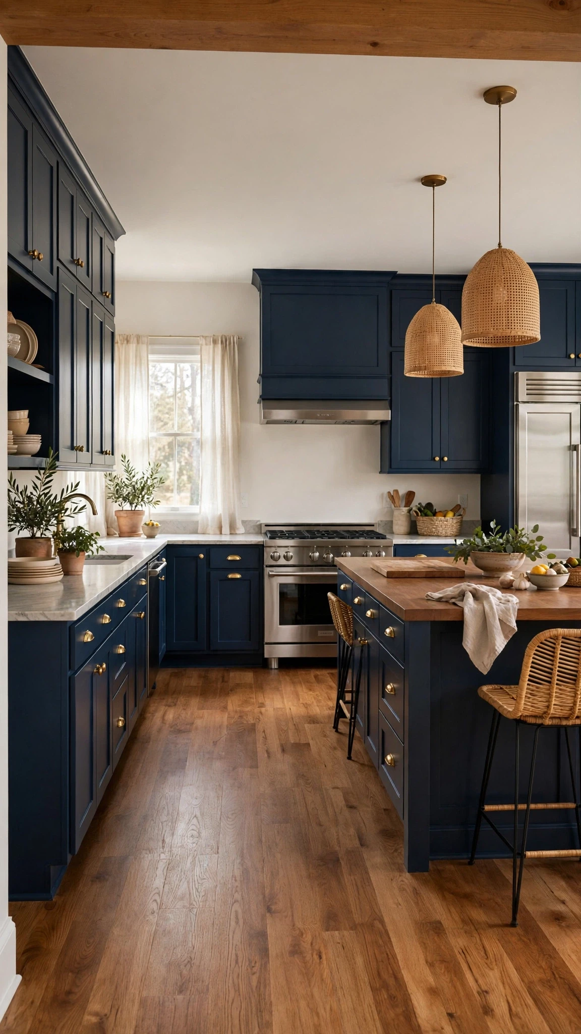
Floor colour makes or breaks a navy kitchen. Warm wood floors, honey oak or medium walnut, reflect just enough warmth to stop the room feeling cold, while a cool grey floor can push the whole scheme over the edge into chilly. If you already have warm wood floors, navy cabinets are an easy win.
If your floor is cool-toned, a large natural rug or a wooden island top can add the warmth back without replacing anything. The rule is simple: for every cool surface in a navy kitchen, add one warm one, and the room stays balanced.
13. Under-Cabinet Lighting That Stops Navy Going Black at Night
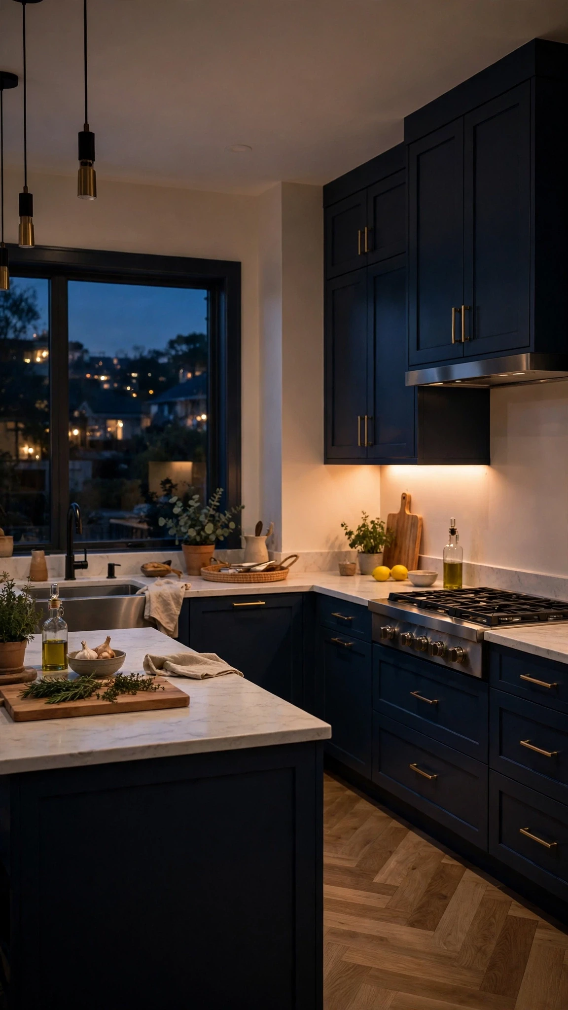
Navy cabinets look completely different at night. Without light, they can turn into black shapes, and the kitchen feels smaller and harder to work in. Under-cabinet lighting fixes that for very little money, washing the counters in warm light and letting the blue read as blue even after dark.
Choose warm white strips, around 2700K, and run them along every work surface, not just the main one. The light also makes cooking safer and the room more inviting in the evening, which is when most kitchens actually get used.
14. Brass Pendant Lights Over the Island
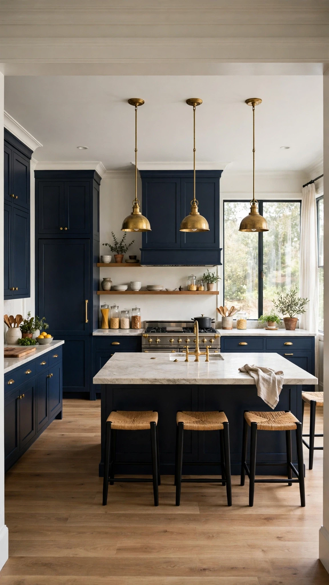
Brass pendants over the island do two jobs at once: they light the work surface and they repeat the warm metal that navy needs. Three small pendants in a row suit a long island, while one larger dome works over a small one, and either way the brass glows against the blue in a way chrome never will.
Hang them low enough to light the counter but high enough to see across, roughly 75 to 90 centimetres above the surface. Dim them in the evening and the kitchen turns from a workspace into a room you actually want to sit in.
15. Glass-Front Uppers So the Top Half Stays Light
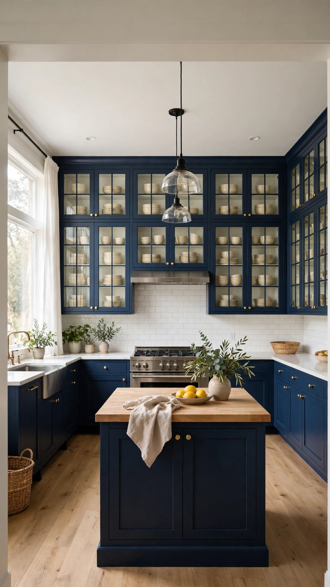
Glass-front upper cabinets are a clever compromise. You keep the storage, but the glass breaks up the solid navy and lets a little light and colour through from whatever is inside. Cream dishes behind glass read as part of the decoration, and the top half of the kitchen feels lighter without losing a single cupboard.
Use glass on just one or two uppers rather than all of them, and keep what is behind it tidy. Frosted or reeded glass is a forgiving option if you would rather not curate the contents, and it still gives you the lightness.
16. A Small-Kitchen Version: Navy on Lowers Only, Light Walls Above
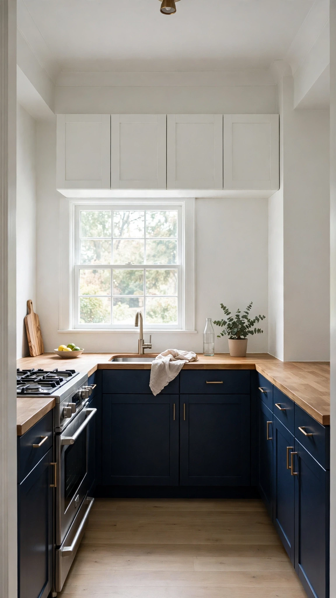
Small kitchens can absolutely wear navy, but the rule tightens: navy on the lowers only, and everything above stays light. Pale walls, white or glass uppers, and a light counter keep the room feeling open, while the navy at the bottom adds depth and hides the scuffs that small kitchens collect.
Add a mirror or a pale backsplash to bounce light around, and avoid dark floors and dark counters in the same small room. Done this way, navy makes a small kitchen feel designed rather than cramped, because the dark colour sits low where it grounds the space instead of closing it in.
17. A Rental Version: Navy Accessories, Backsplash, and Hardware Swap
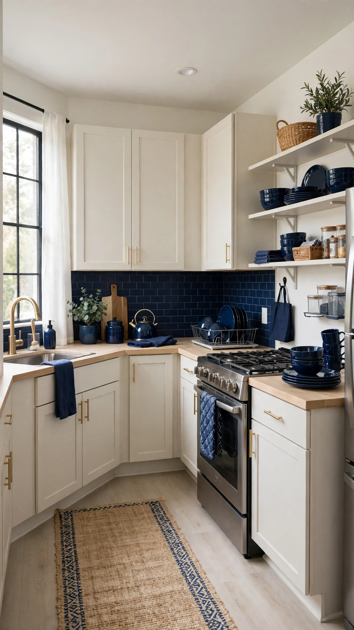
Renters can get the moody blue look without touching the cabinets. A peel-and-stick navy backsplash, navy linen curtains, dark blue dishware on open shelves, and a hardware swap you can reverse when you leave will get you most of the way there. None of it needs permission, and all of it comes with you.
Start with the backsplash and the hardware, because those two changes read as the biggest transformation for the least money. Add navy textiles and accessories to tie it together, and keep your landlord’s original knobs in a bag so move-out day is painless.
18. Navy Cabinets with a Cream Runner and Linen Curtains
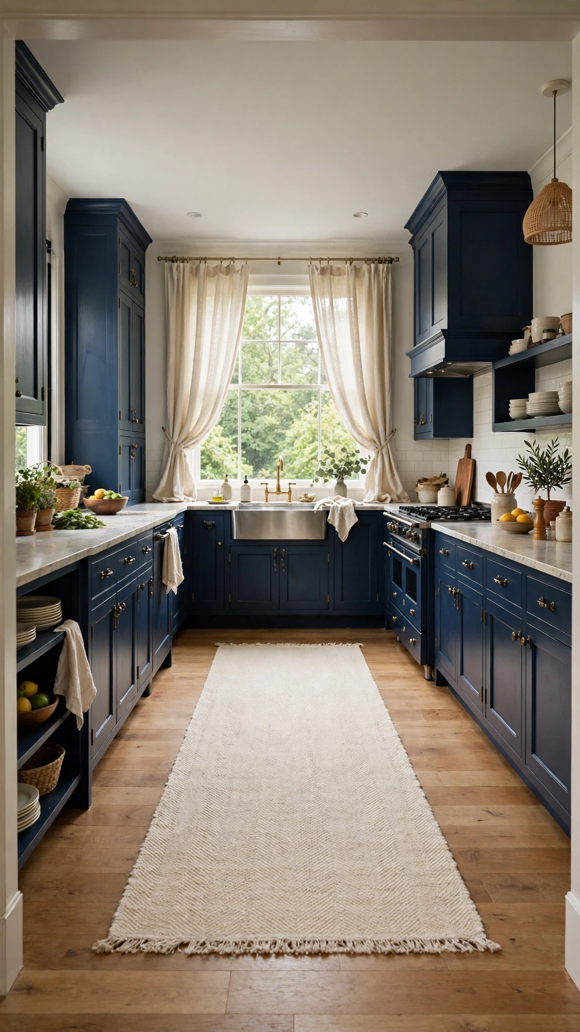
Soft things matter in a dark kitchen. A cream runner on the floor and linen curtains at the window break up the hard surfaces and add the pale, warm layer that navy needs to feel like a home rather than a showroom. The fabric also softens the sound of the room, which is a small thing you notice every day.
Choose washable fabrics, because kitchen textiles get splashed. Cream, oatmeal, and soft natural linen all work, and the runner has the bonus job of protecting the floor in front of the sink and hob, where wear shows first.
19. Moody Blue with One Terracotta or Copper Accent

One warm accent is the secret to a moody blue kitchen that never feels cold. Terracotta pots, a copper pan hanging on the wall, or a single terracotta dish on the counter gives the eye a warm counterpoint to all that blue, and the contrast makes both colours look better. The key word is one: a single accent family, repeated in two or three small places.
Scatter terracotta and copper and brass and red all at once, and the room turns busy. Pick terracotta or copper, use it sparingly, and let the navy stay the star while the warm accent does the quiet work of keeping it friendly.
20. Two-Tone Navy and Soft Grey Cabinets

Navy and soft grey together are quieter than navy and white, and that is their appeal. The grey softens the contrast, so the kitchen feels layered rather than striped, and it suits homes where a crisp white scheme would feel too stark. Use navy on the lowers and soft grey on the uppers, or navy on the island with grey around it.
Keep the counters light and the hardware warm, because grey on its own can go cool fast. Brass pulls and a warm wood floor will hold the whole scheme together, and the result is a kitchen that feels calm, grown-up, and easy to live with.
21. One Light Element Rule: A White Sink, Light Counters, or Pale Walls in Every Version
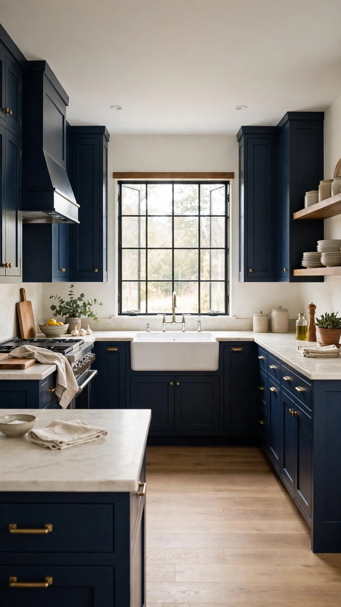
If you remember one rule from this whole list, make it this one: every moody blue kitchen needs at least one big light element. A white farmhouse sink, light counters, or pale walls, any one of them will do, but you need at least one, because without it the navy has nothing to push against and the room goes flat.
Check your kitchen against this rule before you commit to a shade. If everything is already dark, floors, counters, backsplash, then lighten one surface first. That single change is often the difference between a kitchen that feels moody in a good way and one that just feels dark.
Pick the Right Blue for Your Light
Choosing the blue matters more than choosing the idea. Paint a few large samples on the wall and live with them for a couple of days, because navy changes dramatically between morning and evening light. In a sunny room you can go deeper and truer, while a north-facing kitchen suits a slate or grey-blue that will not turn black by afternoon.
Check the undertone too, because a green-blue reads warmer and a grey-blue reads cooler, and the wrong one can clash with your floor. Hold the sample next to your countertop and your floor, not just against a white wall, and pick the blue that looks good next to the things that are already staying.
Rental-Friendly and Budget Swaps
If a full repaint is out of reach, start in this order: hardware first, then backsplash, then accessories, and paint last. Brass knobs and a peel-and-stick backsplash can change the feel of a kitchen in a weekend for very little money, while navy dishware, curtains, and a runner finish the look without any permanent change.
When you do paint, paint the lowers or the island first and live with it before committing to the whole room. That way you learn whether you love the colour in your light, and if you do, the rest of the kitchen can follow at whatever pace your budget allows.
FAQs
What blue is best for kitchen cabinets?
Navy with a soft undertone suits most kitchens, while slate blue works better in low light. Paint large samples and check them morning and evening, because the same blue can look rich in daylight and almost black at night, and the sample is the only honest test.
Will navy cabinets make my kitchen look dark?
Not if one surface stays light. Keep the counters, backsplash, or walls pale, add under-cabinet lighting, and use brass and warm wood to balance the dark colour. A kitchen only feels dark when every single surface is dark at once.
What countertop goes best with navy cabinets?
White marble or marble-look quartz is the classic partner, because it reflects light and keeps the room bright. Butcher block is the warmer option, and mixing the two- marble on the perimeter and wood on the island- works beautifully in most layouts.
What hardware suits moody blue cabinets?
Warm brass suits navy best, because it catches the light and warms the dark doors. Cup pulls on drawers and small knobs on doors are a reliable combination, and keeping one finish throughout the room looks the most intentional overall.
Can I use dark blue in a small kitchen?
Yes, with navy on the lowers only and light walls and uppers above. Add a pale backsplash and warm lighting, and avoid dark floors and dark counters in the same small room so the space stays open, bright, and welcoming.
How do I get this look in a rental?
Use a peel-and-stick navy backsplash, swap the hardware and keep the originals safe, and add navy curtains, dishware, and textiles. All of it reverses completely on move-out day without damage, and together it reads as a genuinely moody blue kitchen.
How do I clean matte navy cabinets?
Wipe them with a soft cloth, warm water, and a little mild soap, then dry them straight away. Avoid abrasive pads and harsh sprays, because matte finishes mark easily, and deal with grease splashes promptly rather than letting them sit.
Conclusion
A moody blue kitchen is not about being brave with colour; it is about being careful with light. Get the blue right for your room, keep one surface light, and let brass and warm wood do the warming, and navy becomes the calmest, most elegant choice you could make.
Start with one idea from this list- the lowers, the island, or even just the hardware- and see how it feels in your kitchen. You can always add more blue later, but a kitchen that already feels good in the morning light is a kitchen you will love for years.